MAIN ARCHIVE
WEB PORTAL
Logo design, identity and brand development
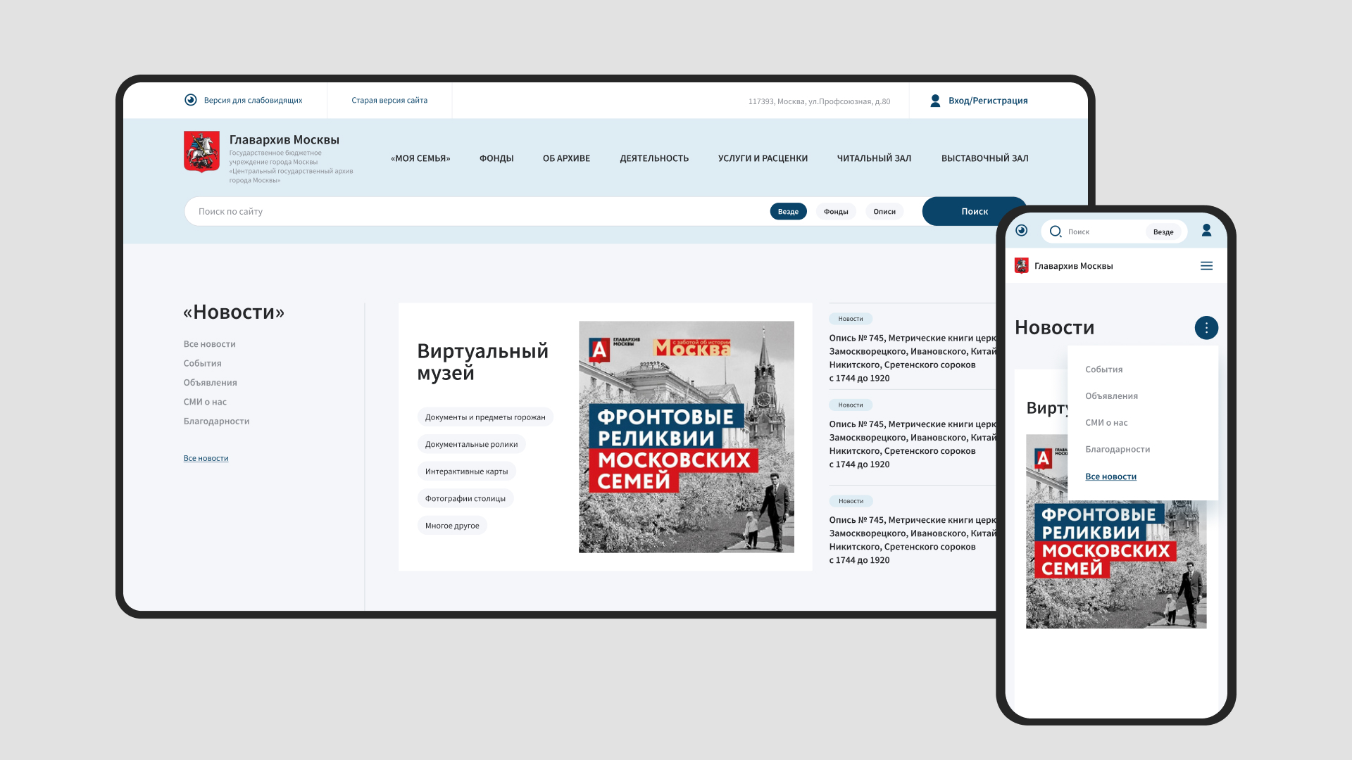
TASK
Carry out a complete redesign of the existing website of the Moscow State Archives.
The current version of the site was visually outdated, with inconvenient navigation and information search.
WHAT WAS DONE
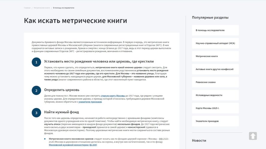
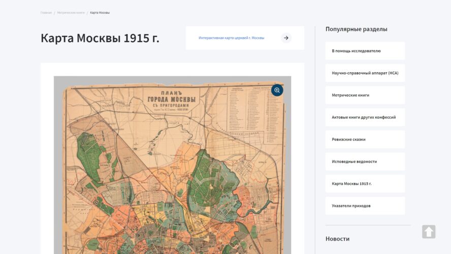
The site structure was redesigned.
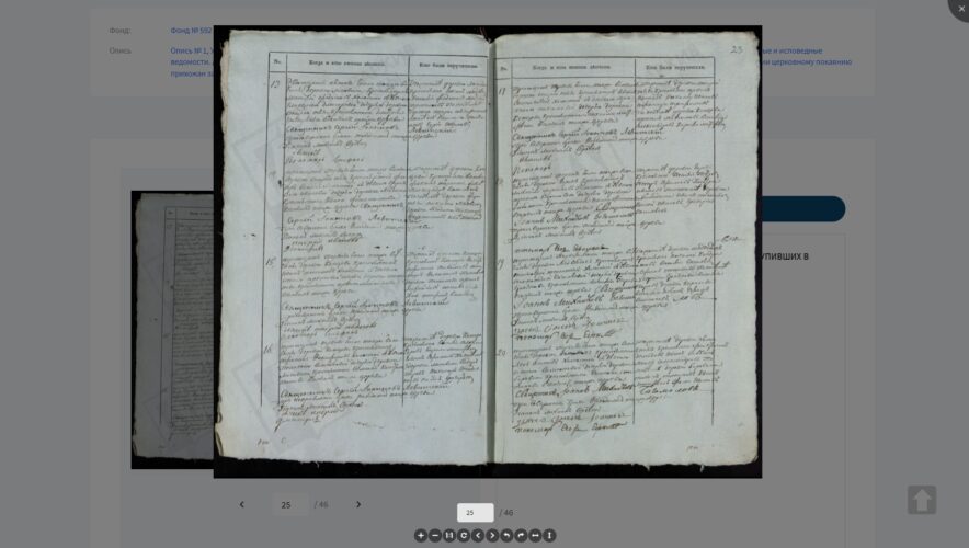
The script for studying archival documents was improved.
Perception of information was made easier.
Usability was improved.
For this project, a detailed analysis of competitors and target audience was carried out. We studied the sites of 7 major competitors and collected information about the behavior of 112 users on our site.
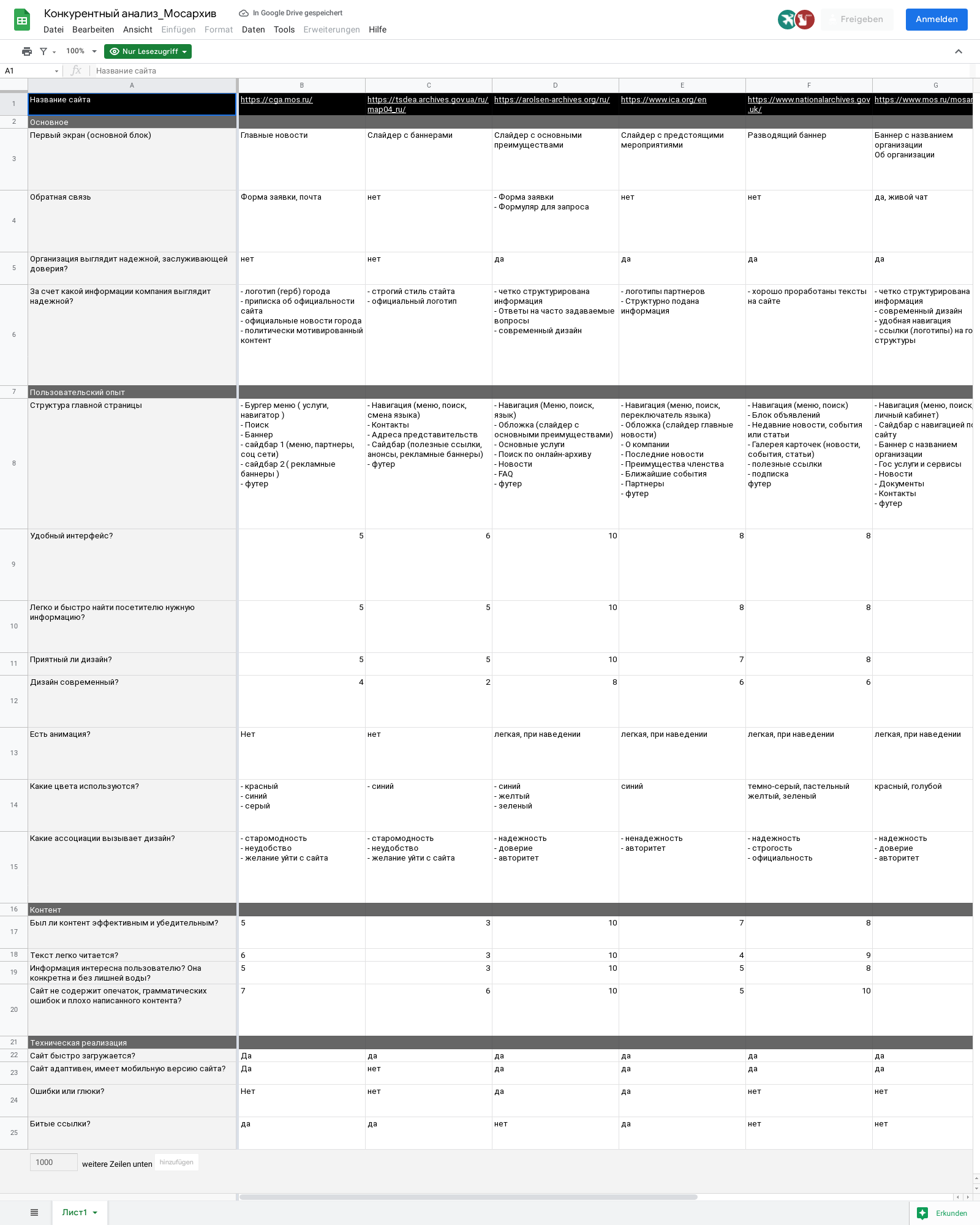
The results of the competitive and user analysis are presented in the form of a table with key questions and answers to them. In this case, we paid attention to the following aspects:
- Does the organization’s website look reliable and trustworthy?
- What associations does the color scheme evoke?
- What information is highly likely to increase user confidence?
- How easily and quickly can a visitor find the information they need?
- Was the content effective and persuasive?
- Does the design feel nice and modern?
- How convenient is it to use the site on mobile devices?
Thanks to this approach to the development of design, we can consider the real pain and requests of the audience.
Navigation
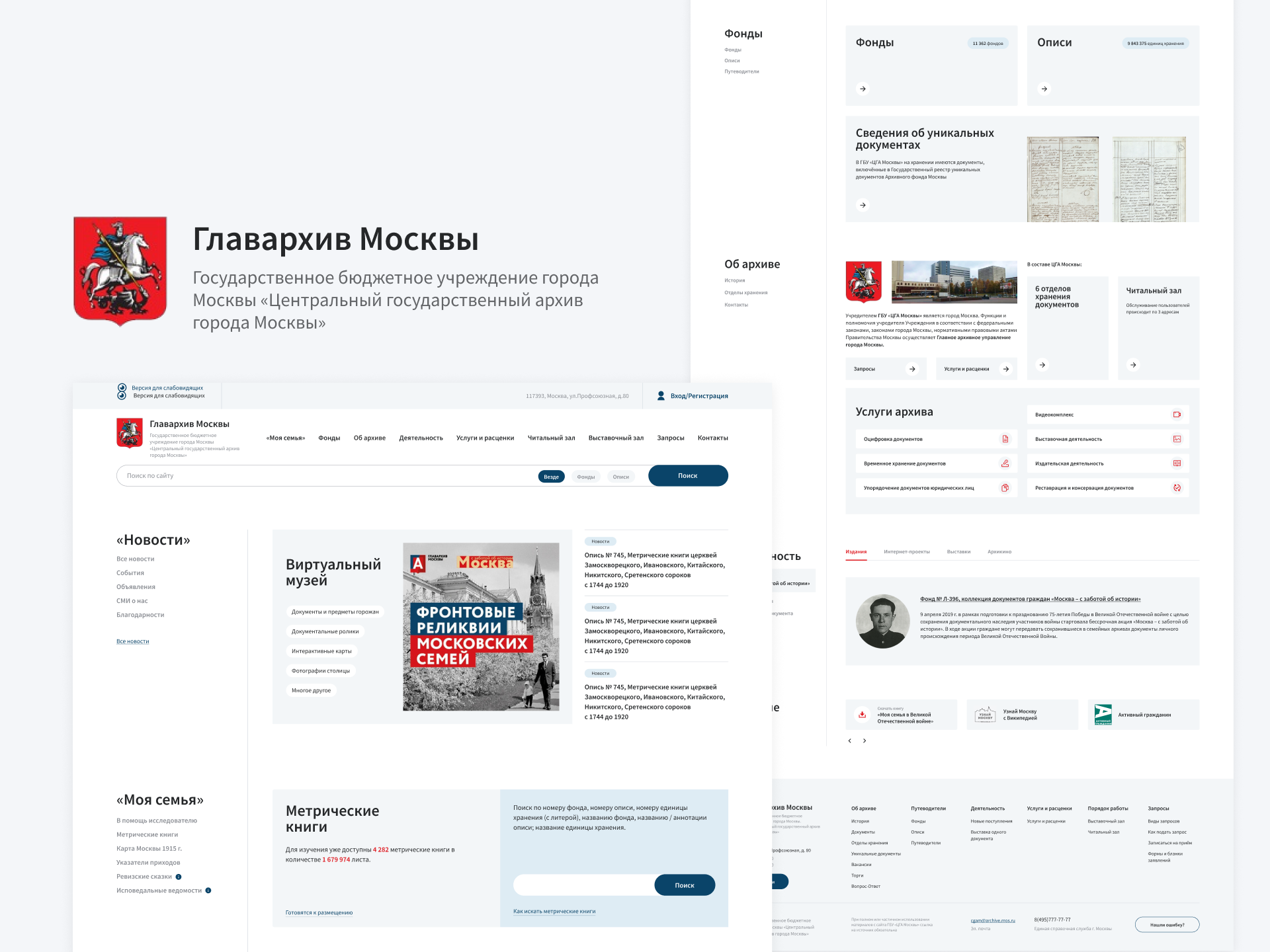
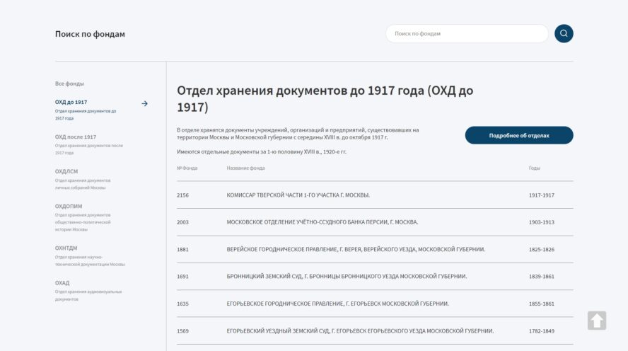
According to the results of behavioral analysis, the most viewed section is “My Family” – it contains the catalog of registers. Therefore, on the main page, this block is located first, followed by funds and inventories. To strengthen the user confidence, an information block “About the archive” is provided, which contains a brief description, several links to internal sections and services of the archive.
To make the navigation easier, a side menu was added to the left of each block: it contains the block title and links to additional sections. We followed a similar structure on the inner pages.
SEARCH
Since the Main Archive of Moscow contains a huge number of documents, among which it is quite difficult to find the right one, we made a special emphasis on the search and its ease of use. The search bar is located directly in the header of the site and is stretched to the full width of the content area.
A user can not only enter a request, but also use quick filtering by funds, inventories or cases. Given the large number of books, this filter significantly speeds up the search process, allowing you to search immediately in the right place.
COLOR SCHEME
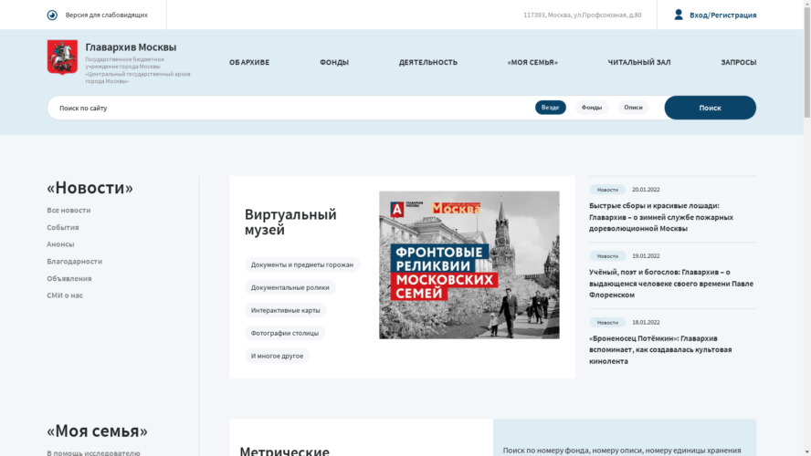
A state site should combine a sense of formality and care for people. As accent colors, we used the colors of the official flag of the Russian Federation — blue and red. Light blue was chosen as the main background color. Smooth shapes and rounded corners of the buttons add to the feeling of friendliness and care.
WHAT WE REJECTED
During the development process, the idea of creating a user’s personal account was considered. It was supposed to be a place for storing selected documents: during a search in registers, the user could mark the necessary document and subsequently it would be available in the personal account.
However, the client was on deadline for the project, so a decision was made to postpone this idea for further development.
Let’s work together

Oleg Frolov
CEO of Webnauts.pro
Write to us via Telegram
@Oleg_Frolov @Oleg_FrolovFeel free to reach out if you want to collaborate with us, or simply have a chat.
Thank you for the request!
Your message has been send successfully
We will contact you soon
Something went wrong...
Your message was not sent